SocialliiASD
Branding & Web Design

Project Overview
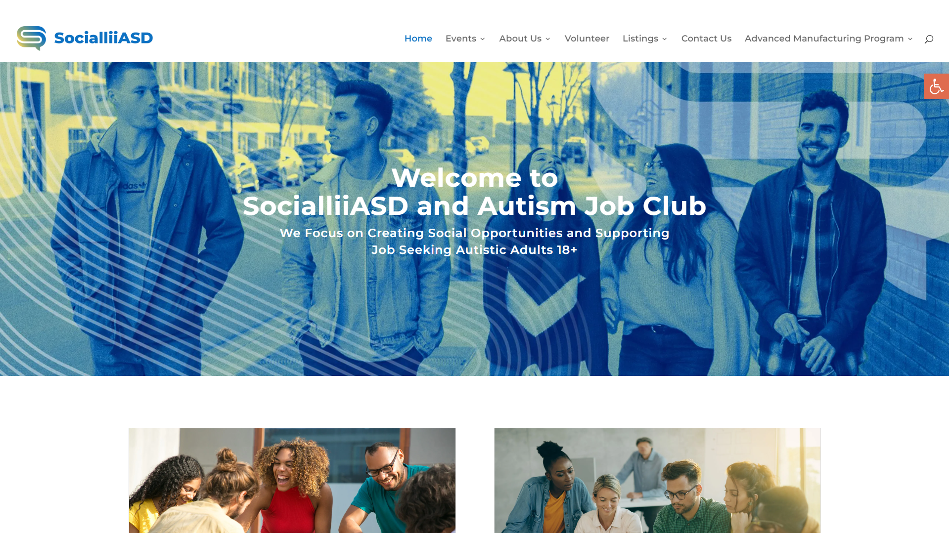
SocialliiASD is a community focused organization that supports autistic adults through social events, volunteer opportunities, and partnerships with external organizations. The existing website did not reflect the organization’s mission or the needs of its users. The visual design felt uninviting, navigation was confusing, and important information was difficult to find.
The goal of this project was to redesign the website to be welcoming, easy to navigate, and AODA compliant, while introducing a clear brand identity that could support long term growth and engagement.
Changes have been made to website since my time working on it. Pages or elements not
resembling the project gallery images were not a creation of my own.
Project Scope
Web Design
Branding
Applications & Tools
WordPress
Divi Theme
Adobe Photoshop
Adobe Illustrator
Duration
Start – June 2022
End – August 2022
Building The Website
Problem Statement
The original SocialliiASD website struggled to support its users effectively. Colours, fonts, and content styles were inconsistent, creating visual noise and making the site feel overwhelming. Navigation paths were unclear, calls to action were missing, and key information about events and involvement was difficult to locate.
For neurodiverse users in particular, this created unnecessary friction. The site needed to prioritize clarity, predictability, and accessibility while still feeling friendly and community driven.
Users & Audience
The website was designed to support multiple audiences, with a primary focus on:
-
Autistic adults aged 18 and older looking to attend social events
-
Volunteers interested in getting involved with the organization
Secondary users included employers, sponsors, and external partners looking to learn more about the organization and opportunities for collaboration.
Design decisions were made with accessibility, clarity, and ease of navigation as top priorities for all users.
My Role
I was responsible for the end to end redesign and build of the website. This included:
-
Designing new layouts and page structures
-
Establishing a refreshed visual brand across the site
-
Building the website in WordPress using Divi
-
Improving accessibility to align with AODA guidelines
I also collaborated with board members through heuristic evaluations, where we reviewed usability issues together and identified areas for improvement. These evaluations directly informed the design and structural changes that were implemented.


Design Process
Heuristic Review and Content Evaluation
The project began with a heuristic evaluation of the existing site alongside board members. We identified key usability issues such as poor navigation structure, unclear user flows, and missing or buried content. From there, I reorganized the site architecture to create a more logical and predictable flow between pages.
Visual and Interaction Design
A major focus was creating a visual system that felt calm, welcoming, and consistent. Colours and typography were selected to reduce visual strain while maintaining a clear hierarchy. Layouts were simplified to limit cognitive overload and guide users toward key actions.
Accessibility & Build
Accessibility was considered throughout the build process. I ensured proper contrast, readable font sizes, consistent spacing, and straightforward navigation patterns. The site was implemented in WordPress using Divi, allowing the organization to maintain and update content easily over time.
Key Design Decisions
-
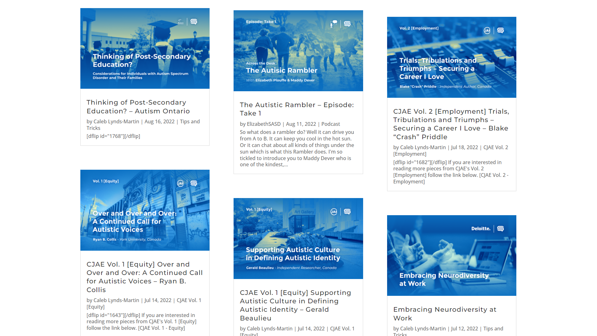
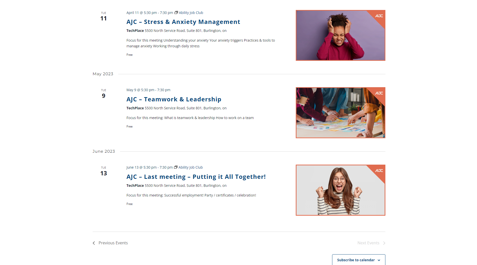
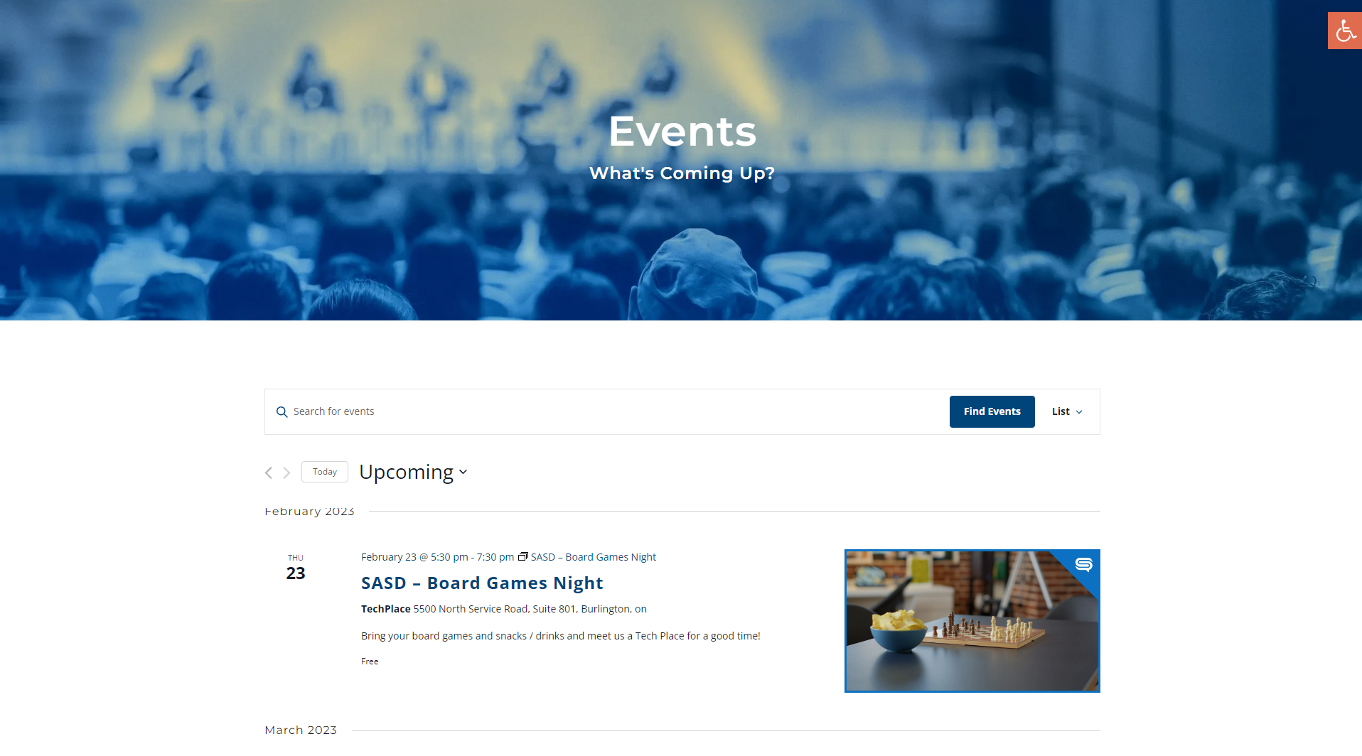
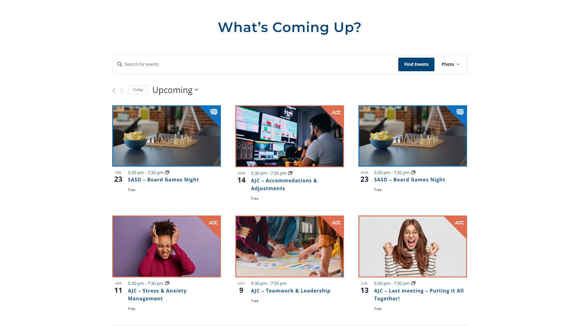
Introduced clear calls to action so users can quickly find events, volunteer opportunities, and ways to get involved
-
Simplified navigation to reduce confusion and support predictable user flow
-
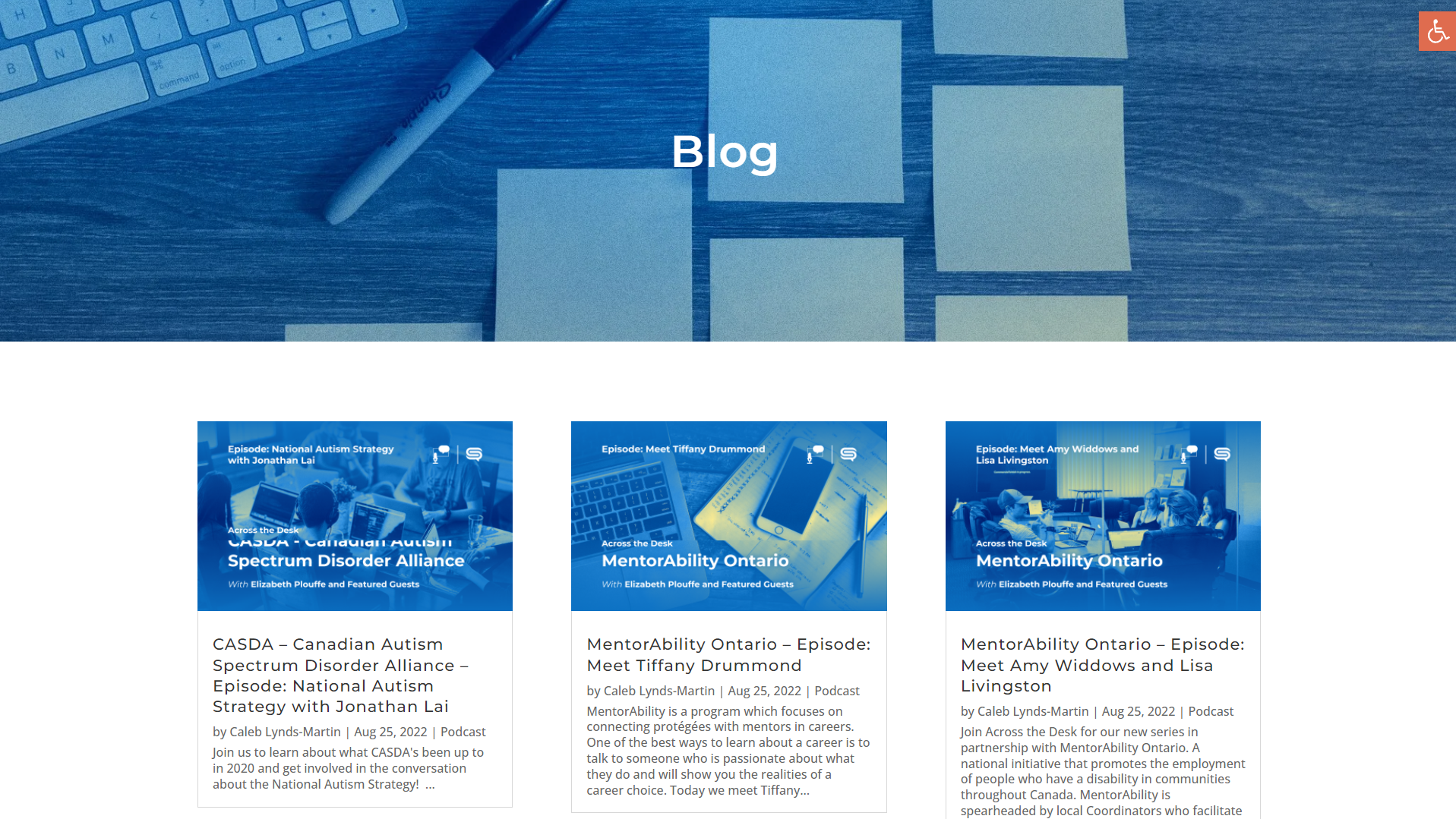
Created a consistent visual identity across all pages to strengthen brand recognition
-
Designed layouts that prioritize readability and accessibility for neurodiverse users
Each decision was made to reduce friction and support users in accomplishing their goals with minimal effort.

Outcome & Impact
The redesigned website now reflects a clear and welcoming brand identity that aligns with SocialliiASD’s mission. Navigation is easier to understand, important information is easier to find, and the overall experience feels calmer and more intentional.
Feedback from primary users has been very positive. Neurodiverse adults reported that finding events and understanding how to get involved felt significantly easier. Volunteers and external organizations were also better able to understand the organization and opportunities for partnership.
Reflection
This project reinforced the importance of designing with empathy and clarity, especially when working with neurodiverse communities. Small decisions around layout, hierarchy, and consistency can have a meaningful impact on usability. It also highlighted the value of collaborative heuristic evaluation when working with non design stakeholders.
Project Gallery